2024 Elections Dashboard
BRIEF
The National Task Force on Election Crises (NTFEC) aims to ensure free, fair, and safe elections. Recognizing the need, our team developed a user-friendly tool for the 2024 elections.
In my role leading creative direction and UI/UX design, I crafted a dashboard-style tool aligned with NTFEC's goals of conceptualizing an interface that would effectively convey timely and accurate information to journalists, civil society leaders, and public officials, enabling them to prevent or mitigate potential election crises.
I managed relationships with our web vendor and developer, facilitating communication and feedback sessions with the client. Despite project complexities, we met budget and time deadlines, delivering a high-quality product supporting NTFEC's mission.
PROCESS
Research & Discovery > Wireframe & Design > User Testing & Iteration > Production & QA > Launch
RESEARCH & DISCOVERY
I conducted an examination of similar tools (for example, ADL's Hate Crime Map). After a thorough evaluation of available libraries, Mapbox was chosen for its API capabilities, distinct features, and user interface flexibility. Since the task force had a predefined methodology, collaborative discussions and feedback sessions were held to determine the optimal data visualization method. Ultimately, the decision was made to utilize a choropleth map to present the information effectively.
WIREFRAME & DESIGN
The team began by prioritizing which of the gathered information would be most important for the audiences.
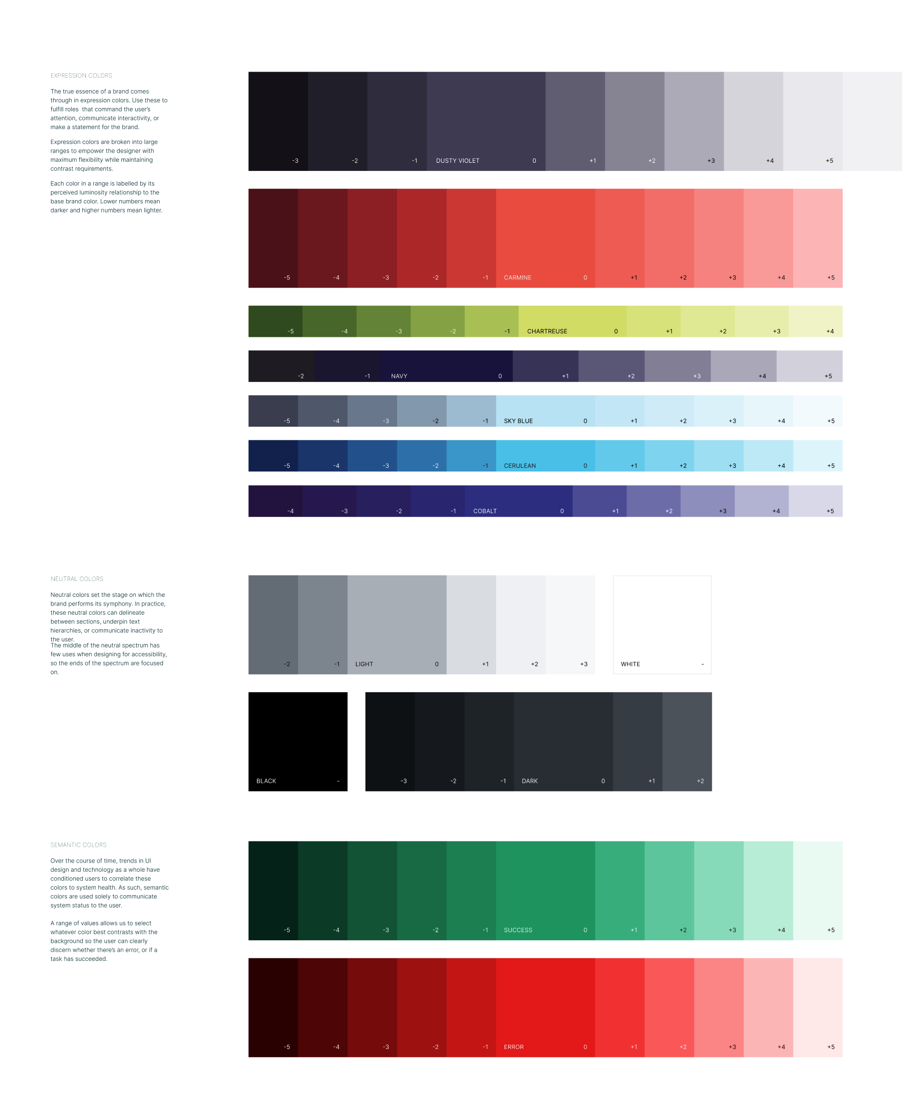
We iterated through user flows and expanded upon the existing Task Force brand by introducing UI tints and shades, ensuring developers' flexibility in future decisions.
Discussions were held on effectively utilizing the brand colors to display choropleth data while maintaining a nonpartisan approach.
USER TESTING & ITERATION
As I refined the wireframes into high-fidelity mockups, I made color decisions that determined different element states to ensure cohesiveness and accuracy while avoiding misinterpretation of data.
Additionally, I began the process of developing icons to represent categories of election incidents, with decisions being made, for example, on whether or not the icons should be a uniform color or differentiated for better visual recognition.
Production & QA
In this penultimate phase, the team underwent a final production decision, including the addition of a popup window that would further contextualize the map and clearly state intention and methodology.
LAUNCH & RECEPTION
The map was launched on April 11, 2024, supported by a multi-channel digital marketing promotion.
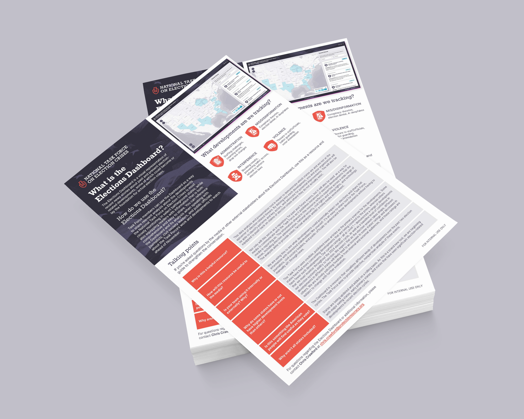
I led the creative development of public-facing digital and print materials the support of the launch.


